I was the design lead for SabreSonic Air – a white-label booking engine app that drives air, anchillary purchase conversions, and traveler loyalty for 200+ airlines across the world.
Product
Responsive web
Skills
Design strategy workshops
Journey mapping
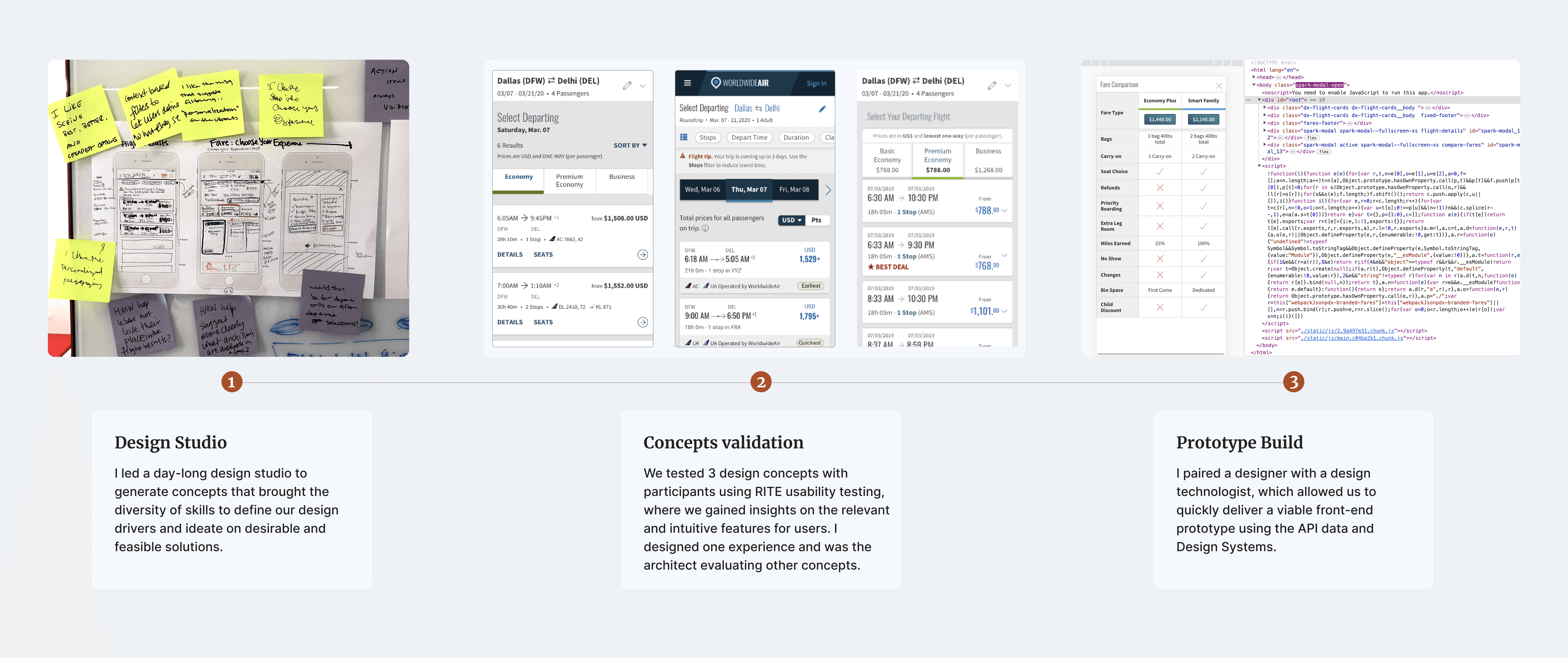
Co-led prototype ship to developers
Accessibility compliance
UX project management
My role
Design lead
Collaborated with a team of two designers, researcher, and design technologist
Timeline
8 weeks in 2019
What we learned
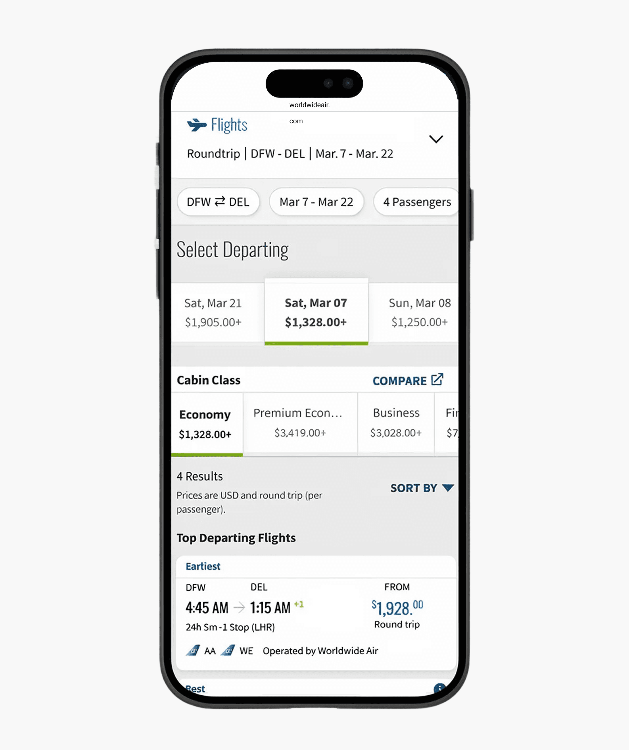
The current mobile web shopping flow is inefficient driving airlines to question if they need to build booking into their native app—removing Sabre out of their digital ecosystem.
In 2018, industry forecasts predicted mobile app check-in would grow from 11% to 28% of all passengers by 2020. Yet adoption across SabreSonic's white labeled mobile web experience told a different story. Users across 225 airline clients reported difficulty finding flights and comparing fares, leading to drop-off at the flight results page. Over time, repeat users migrated back to desktop, a trend confirmed through behavioral analysis with key airline clients.
Some key numbers
Only 23%
of leisure travelers are confident they can find all of the same flight information on their smartphone that they can on their desktop
2/3
of leisure travelers double-check prices on desktop after shopping for flights on a smartphone
40 million passengers boarded
approximate number through a single Sabre airline client in 2019
Reframing the Conversion Problem
If visitors to the websites using mobile devices increases, the conversion rates will go down. Even if the bookings remain the same and revenue goes up.
Product strategy
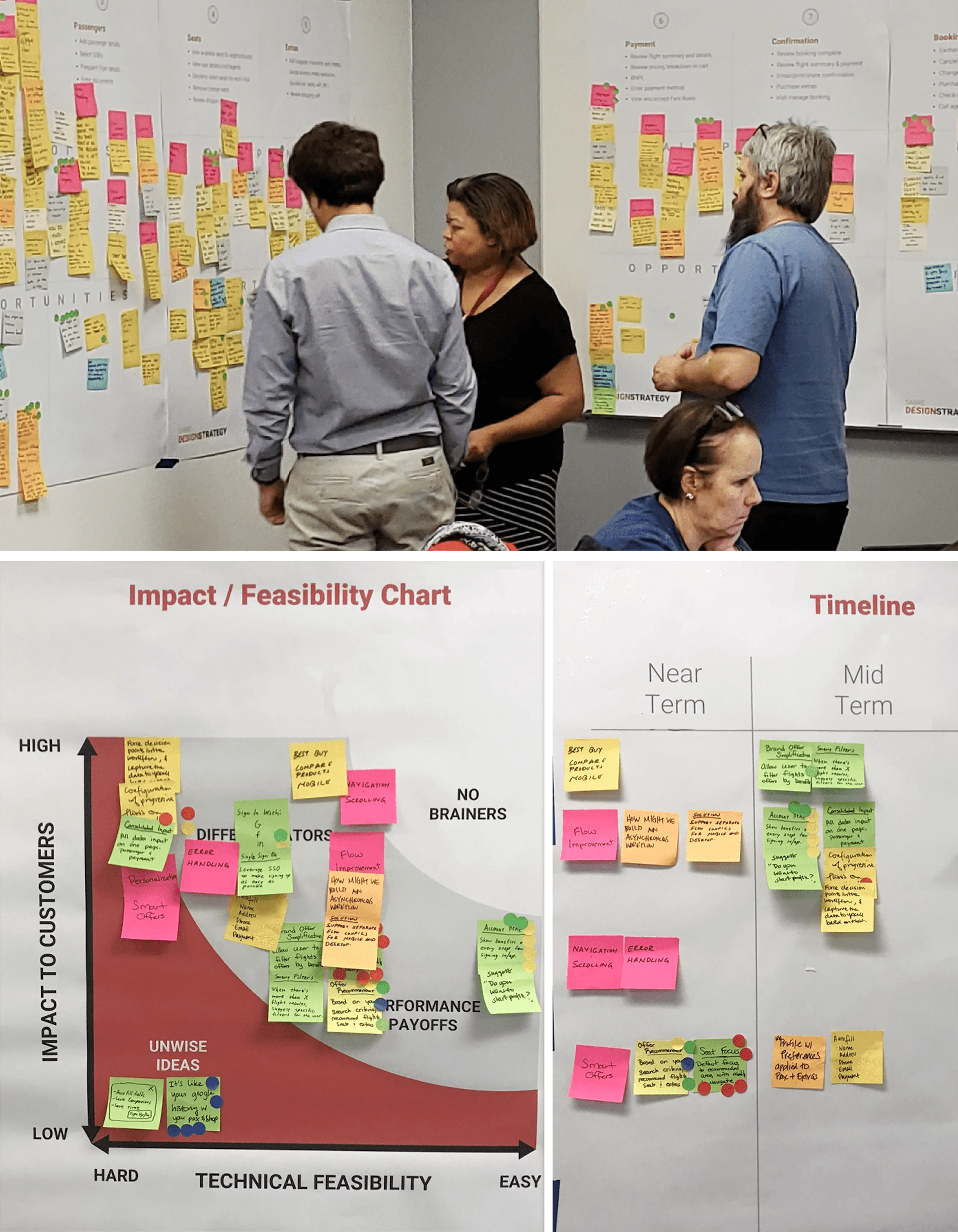
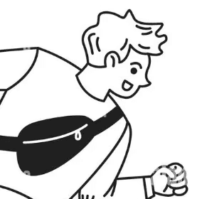
I aligned the organization around this direction by facilitating a design strategy workshop. The resulting roadmap of near, mid, and long-term initiatives was co-authored with the PM, assessed for technical feasibility, and ultimately secured three quarters of funding approval.
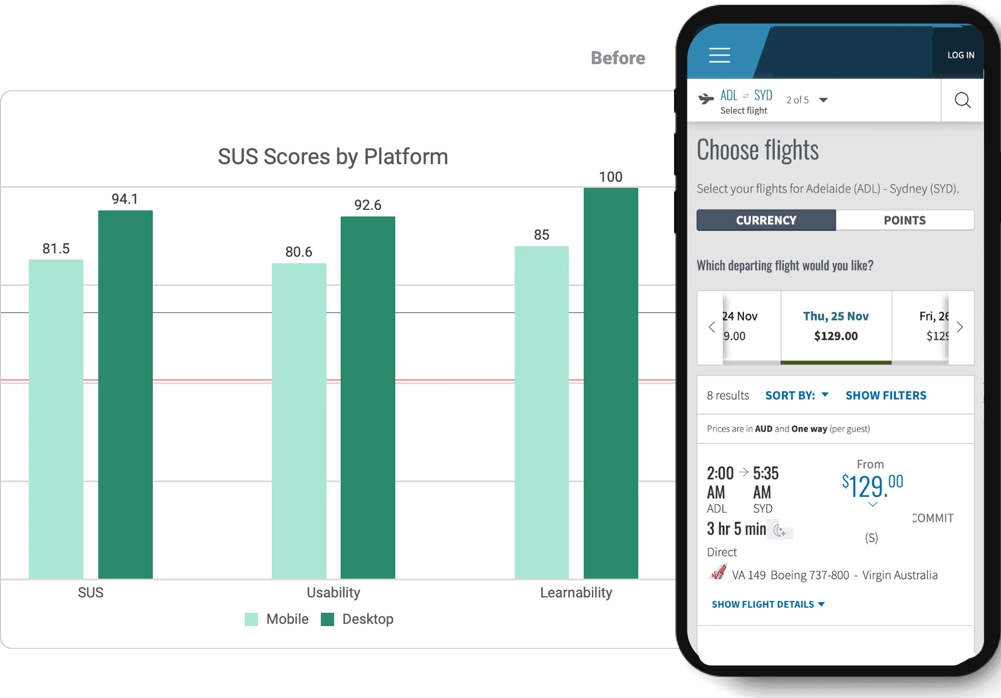
What was occurring for clients was a classic denominator effect in web analytics. Mobile visitors in 2019 were often in "browse and compare" mode rather than "ready to book" mode, which naturally suppressed conversion rates. SUS scored lower with mobile than desktop. Understanding this nuance, the researcher and I optimized for usability and task completion rather than raw conversion rate.
Key differentiators to meet in mobile-first design
Address the 12.6% lower SUS
on mobile than desktop
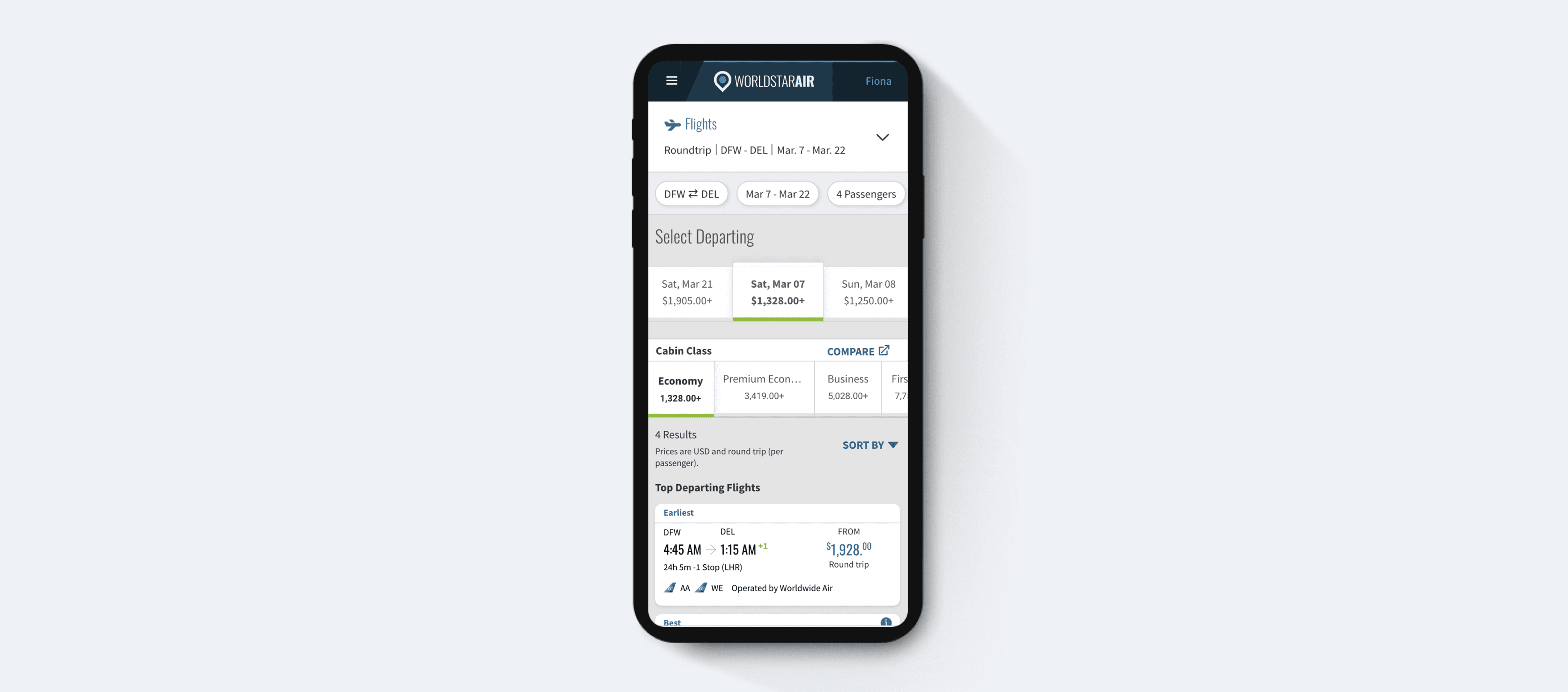
Navigation & Personalization
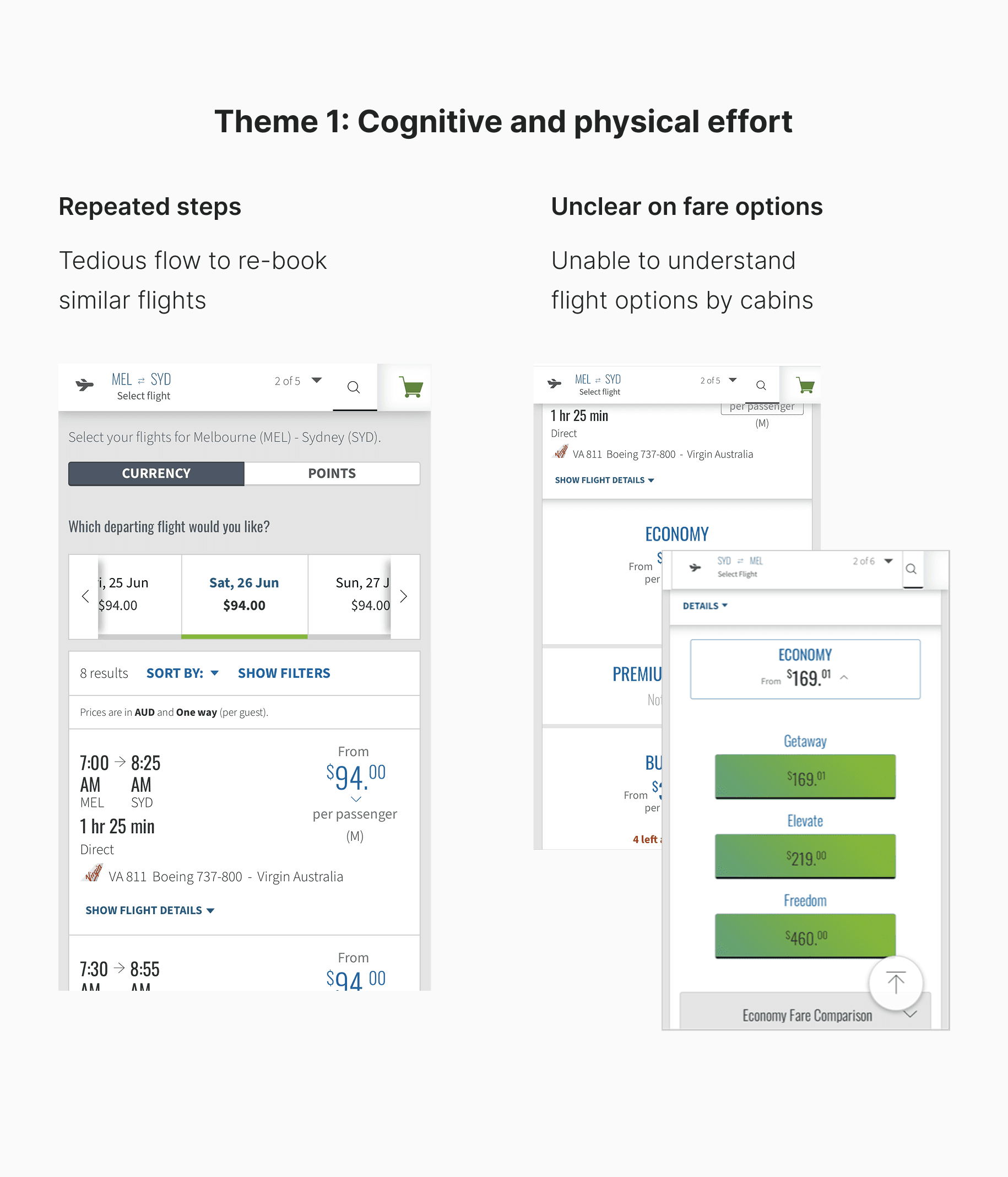
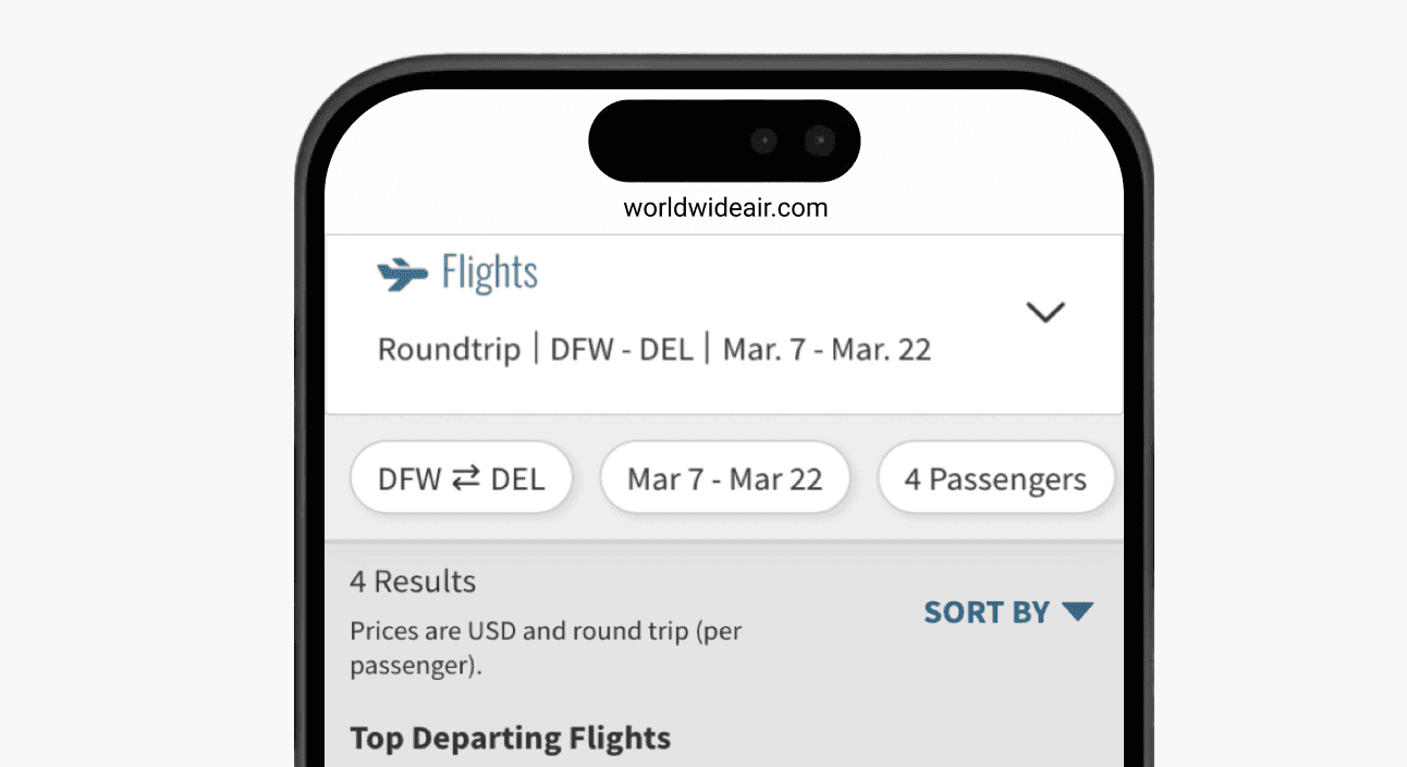
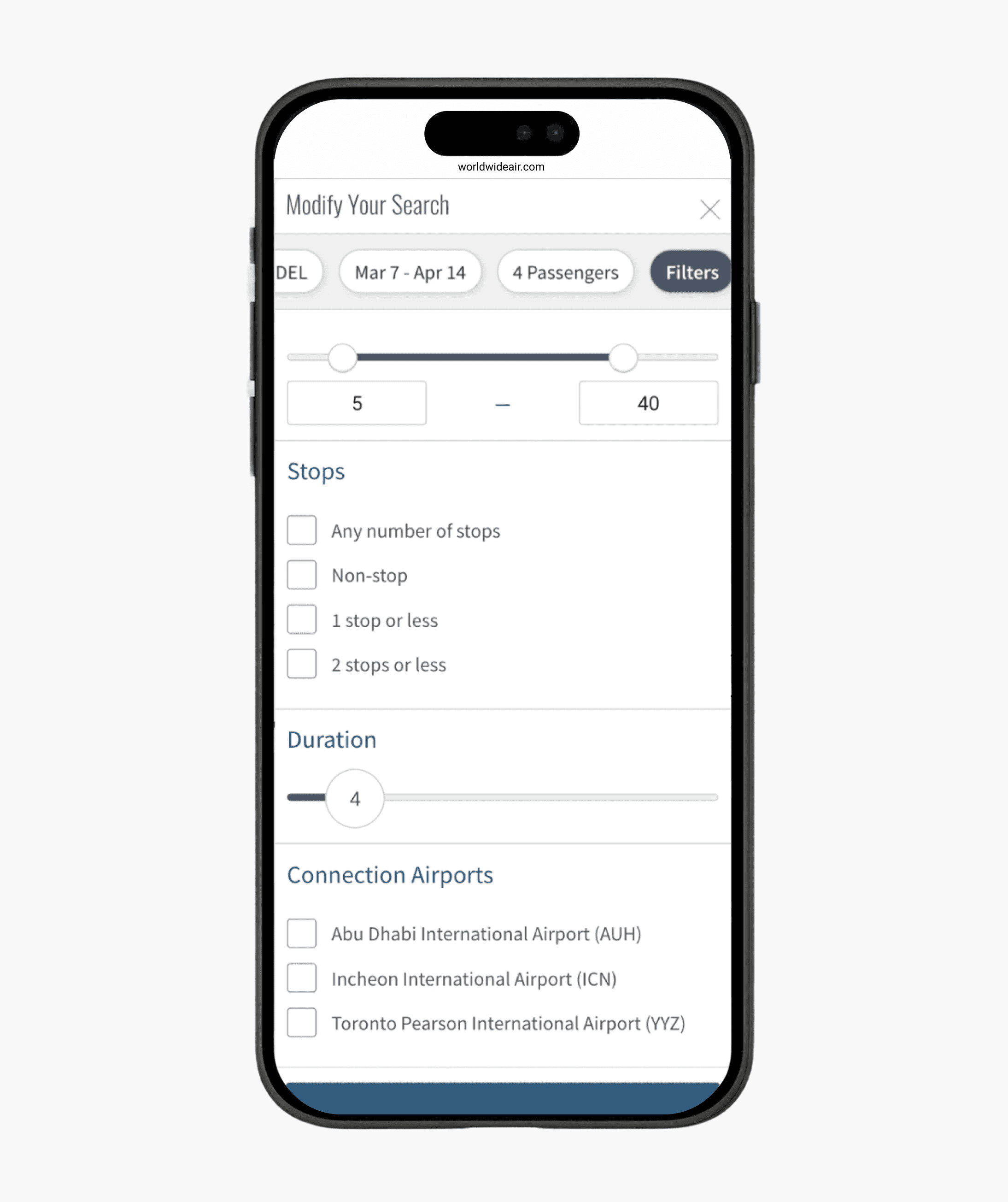
Reduce tedious task to rebook similiar flight with filters and authenticated user experience.
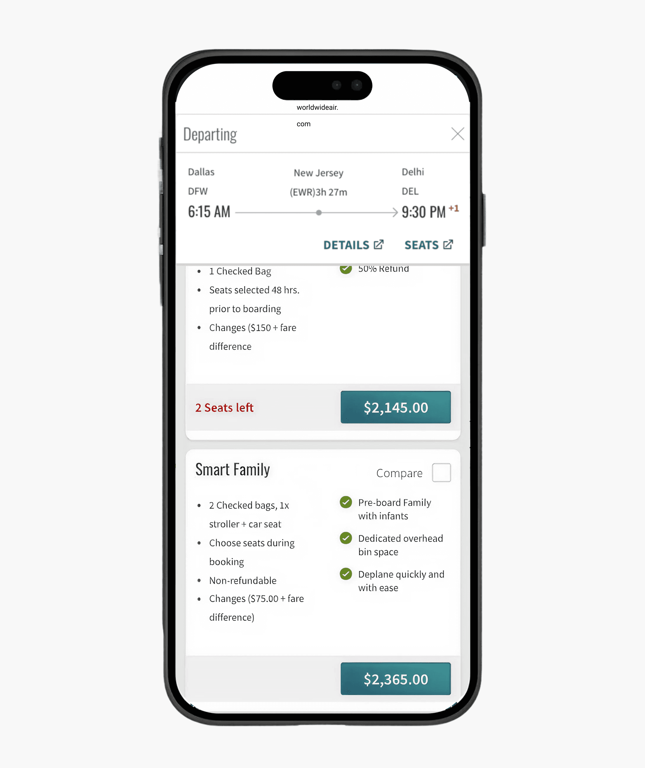
Branded Fares
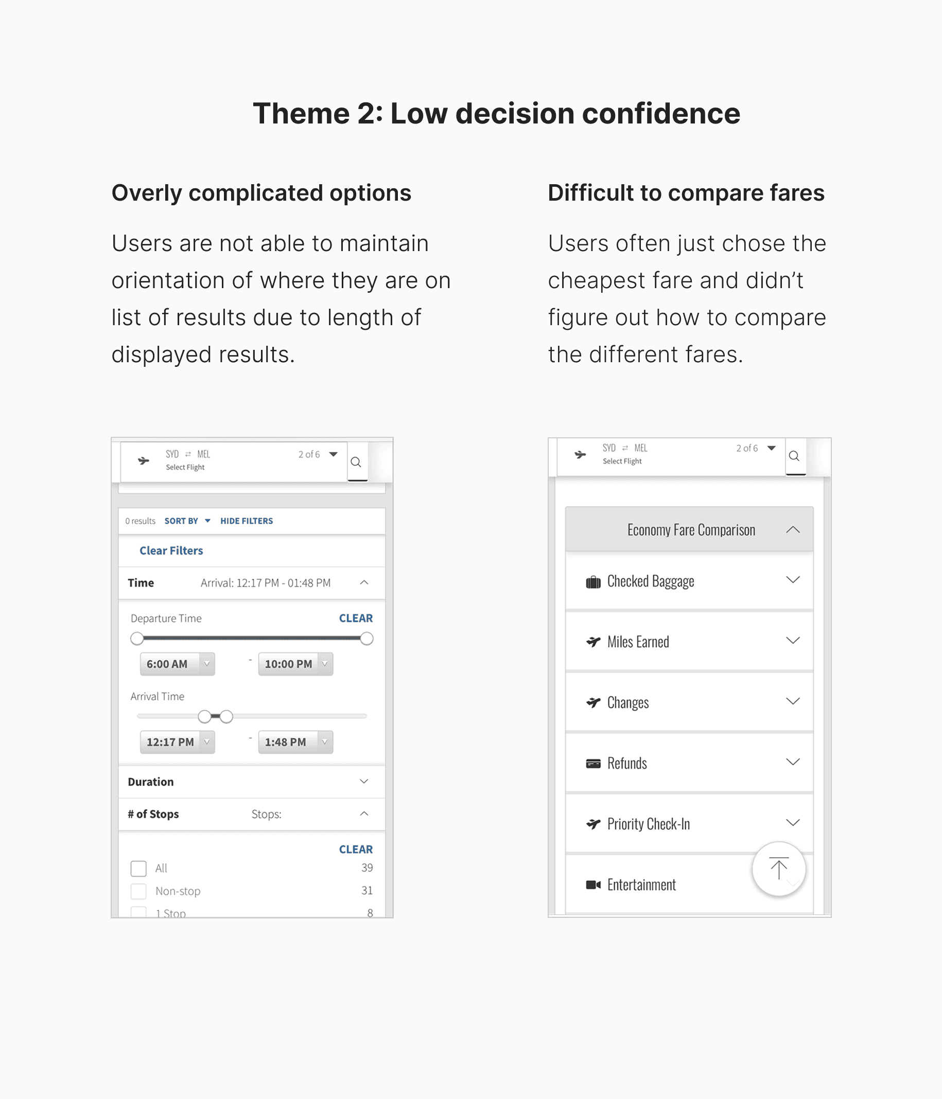
Improve ease of fares comparison for users, finding flights, and offering experience upgrade options as upsell.
Problems with platform-level implications
Sabre was leaving every real user segment underserved with a generic experience.
Repeated steps hit the business traveler hardest
User research on the current implementation revealed that users were abandoning the booking flow not because they lacked intent, but because the experience eroded their confidence at every decision point.
Unable to understand the fares and difficult to compare fares
As a high-tech leisure traveler who wanted the best deal, the irony was that the very user most motivated to comparison shop was the least equipped by the interface to do so, ultimately defaulting to cheapest rather than best value.
Upsell pricing was unclear
A family-based traveler is open to comfort-based upsells and ancillary add-ons, but the cluttered results experience buried the decisions they want to make.
As a frequent business traveler booking within a week of departure, re-entering the same information for similar routes was a direct failure of the platform recognizing his loyalty.